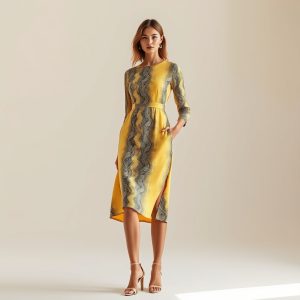
The New Chromatic Narrative: How Butter Yellow and Guardian Design Are Redefining the Poetics of Retro Summer
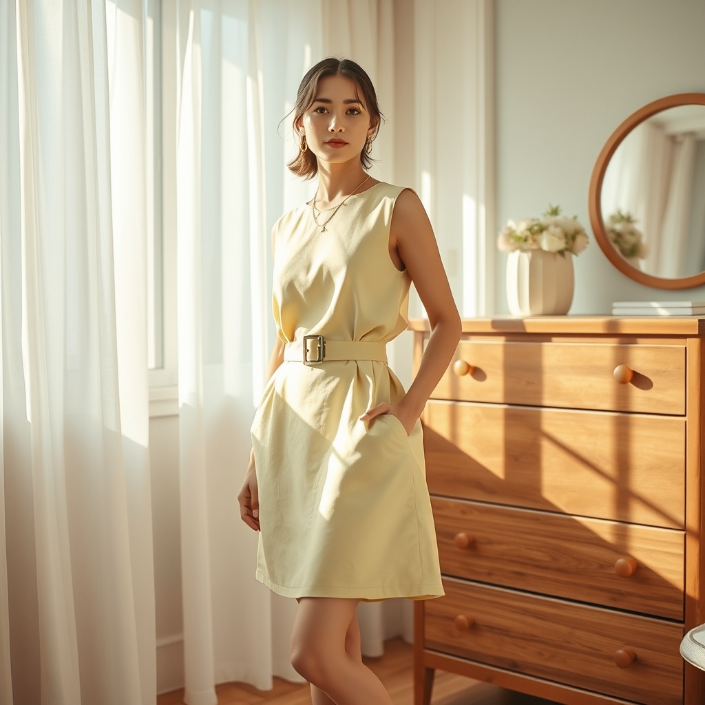
Fashion, at its most potent, is not merely about garments but about the stories they tell. In an era where nostalgia is currency and retro aesthetics are resurrected with surgical precision, the interplay between color and design has become the silent architect of modern style. Among the hues that have emerged as protagonists in this narrative, butter yellow stands out—not for its loudness, but for its quiet insistence on being seen. It is the color of sun-bleached afternoons, of vintage postcards, of a warmth that lingers long after the moment has passed. When paired with the structured, almost utilitarian ethos of Guardian Design, it does not clash; it converses. The result is a sartorial dialogue that feels both timeless and urgently contemporary.
The Alchemy of Butter Yellow
Butter yellow is not a color that demands attention; it earns it. Unlike its more assertive counterparts—neon brights or deep jewel tones—it operates in the realm of the subconscious, evoking nostalgia without ever slipping into caricature. It is the shade of a well-loved book’s pages, of a 1950s kitchen table, of the golden hour’s last gasp. In fashion, it has become the antidote to the stark minimalism that dominated the early 2020s, offering instead a softness that feels almost rebellious in its optimism. When deployed in retro summer collections, it does not merely reference the past; it recontextualizes it, infusing mid-century silhouettes with a modern sensibility that is equal parts playful and poised.
What makes butter yellow particularly compelling is its chameleonic nature. It can be the star of a monochromatic look, lending an air of effortless elegance to a simple shift dress or a pair of wide-leg trousers. Alternatively, it can serve as the perfect foil to bolder elements—think snake print blouses or animal print accessories—where its warmth tempers the ferocity of the motifs, creating a balance that feels intentional rather than accidental. This versatility is what elevates it beyond a seasonal trend; it is a chromatic philosophy, one that speaks to the desire for joy without artifice.
Guardian Design: The Architecture of Modern Dressing
If butter yellow is the emotional core of this new aesthetic, then Guardian Design is its structural backbone. Rooted in the principles of functionality and durability, Guardian Design is not about frivolity; it is about intention. It draws from the utilitarian ethos of workwear and military garments, but refines it with a precision that feels almost architectural. Think tailored jumpsuits with strategic pockets, dresses with built-in belts that cinch the waist without sacrificing comfort, and outerwear that is as much about protection as it is about statement-making. It is fashion that acknowledges the realities of modern life—where movement is constant, where versatility is non-negotiable—without ever sacrificing beauty.
The genius of Guardian Design lies in its ability to feel both protective and liberating. It is the sartorial equivalent of a well-built home: sturdy enough to withstand the elements, yet designed with an eye for aesthetics that makes it a pleasure to inhabit. When paired with butter yellow, the effect is transformative. The softness of the hue softens the severity of the design, while the structure of the garments gives the color a sense of purpose. It is a marriage of form and function that feels distinctly modern, yet timeless in its appeal.
The Retro Summer Revival: A Study in Contrasts
The resurgence of retro summer aesthetics is not merely a case of fashion looking backward; it is a deliberate reimagining of the past through a contemporary lens. The 1970s, with their bohemian silhouettes and earthy palettes, have long been a touchstone for designers seeking to capture a sense of freedom and ease. Yet today’s interpretation is less about replication and more about reinterpretation. Butter yellow, for instance, is not the mustard of the disco era but a softer, more luminous iteration—one that feels fresh rather than derivative. Similarly, Guardian Design’s utilitarian elements are not the clunky, oversized pieces of the 1990s but streamlined, thoughtfully constructed garments that prioritize both form and function.
This revival is also a response to the cultural moment. In an era defined by uncertainty, there is a palpable longing for the perceived simplicity of bygone decades. Retro summer aesthetics offer a form of escapism, but one that is grounded in reality. The clothes are not costumes; they are wearable fantasies, designed to evoke a sense of nostalgia while still feeling relevant to the present. The inclusion of butter yellow and Guardian Design elements ensures that this nostalgia is not saccharine but sophisticated—a celebration of the past that is firmly rooted in the now.
The Poetics of Slow Living
At its core, the intersection of butter yellow and Guardian Design is a meditation on slow living. It is a rejection of the disposable nature of fast fashion in favor of pieces that are meant to last, both in terms of craftsmanship and emotional resonance. Butter yellow, with its associations of warmth and sunlight, invites a slower, more mindful approach to dressing. It is a color that encourages contemplation, a pause in the rush of daily life. Guardian Design, meanwhile, embodies the principles of slow living through its emphasis on quality and functionality. These are not clothes that are meant to be worn once and discarded; they are investments, both in terms of style and sustainability.
The poetics of this aesthetic lie in its ability to balance opposites: softness and structure, nostalgia and modernity, fantasy and reality. It is a reminder that fashion, at its best, is not about extremes but about harmony. The most compelling looks are not those that shout the loudest but those that whisper with intention, inviting the wearer—and the observer—to lean in a little closer. In this way, butter yellow and Guardian Design are not just trends but tools, offering a way to navigate the complexities of modern life with grace and purpose.
The allure of this new chromatic narrative is not in its novelty but in its familiarity. It is a return to the idea that clothes should not just adorn the body but elevate the spirit. In a world that often feels fragmented, the combination of butter yellow and Guardian Design offers a sense of cohesion—a way to feel put-together without sacrificing individuality. It is fashion as a form of quiet resistance, a way to reclaim agency in an era of constant change. And perhaps that is the most powerful statement of all: that elegance is not about following rules but about writing your own.